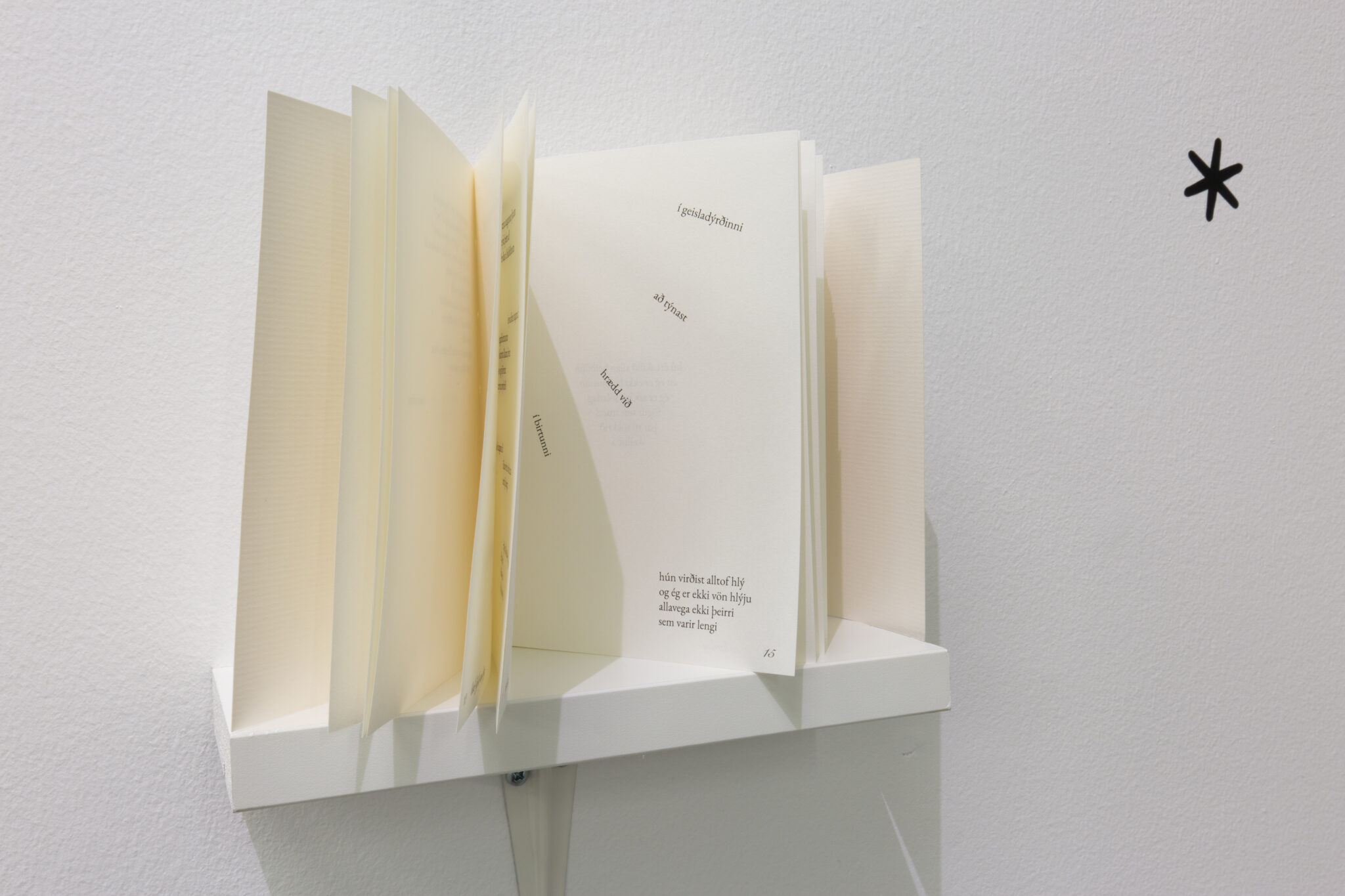
Nótnaletur, líkt og bókstafaletur, fela í sér ýmsa „liti“ og tilfinningar. Þau geta verið alvarleg, skemmtileg eða fræðileg og gefið hugmynd um anda verksins án þess að ein einasta nóta hafi verið leikin. Nýja letrið Tröllaskarð inniheldur tónlistarletur ásamt bókstafaletri í stíl og leitast við að endurspegla töfraheim íslenskra álfasagna og reynir að fanga töfraheim hins óþekkta. Með því að gera nýtt nótnaletur vil ég sýna að það er margt ókannað þegar kemur að framsetningu tónlistar í prentuðu formi.
Music fonts, like Latin typefaces, communicate various “tones” and emotions. They can be serious, playful, or academic, and convey a sense of a work’s spirit without a single note being played. This new typeface, Tröllaskarð, consists of a music typeface and a Latin typeface that make up a unified whole for displaying music. Tröllaskarð seeks to reflect the world of Icelandic elf folklore and attempts to capture the magic of the unknown. By creating a new music font, I want to show that there is still much unexplored when it comes to presenting music in printed form.
Myndir: Claudio Parada Nunes
Hlynur Sævarsson
Tröllaskarð
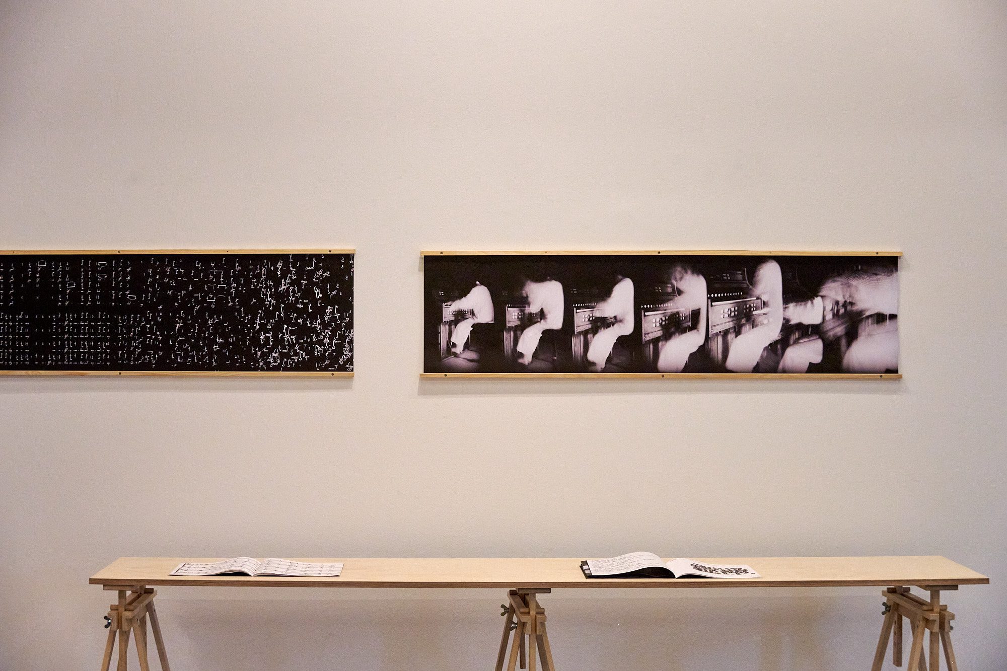
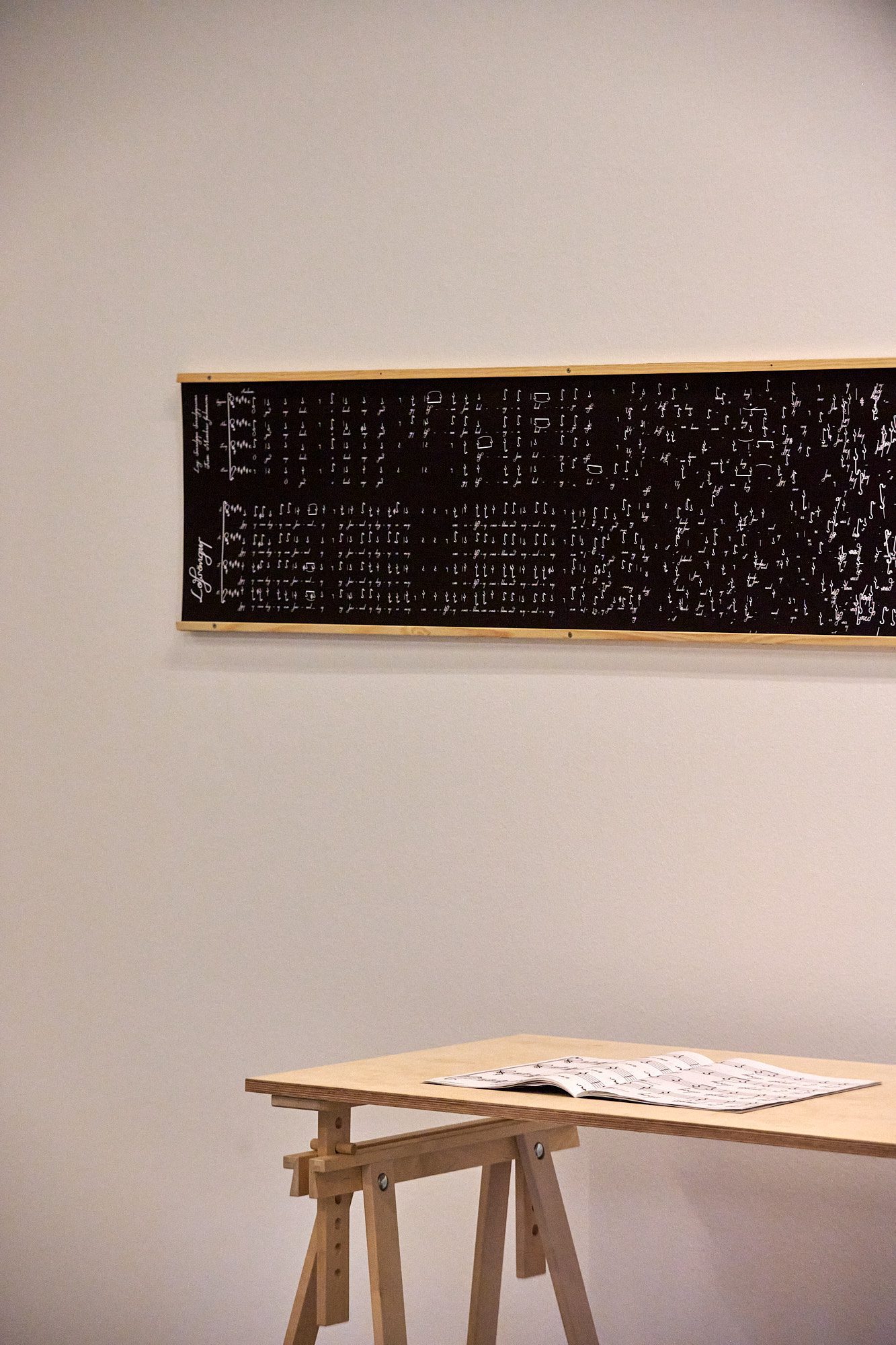
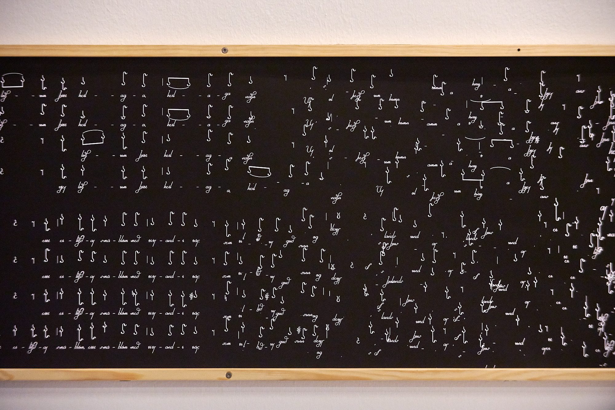
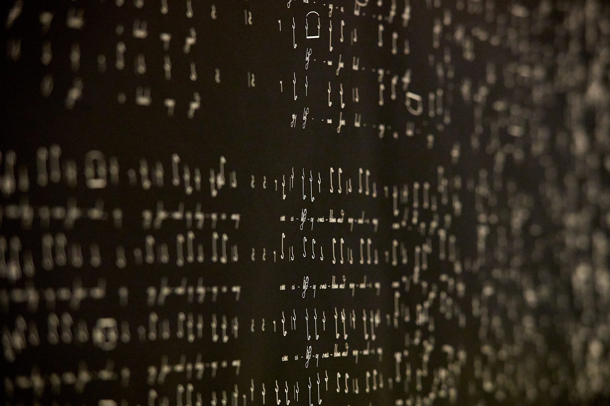
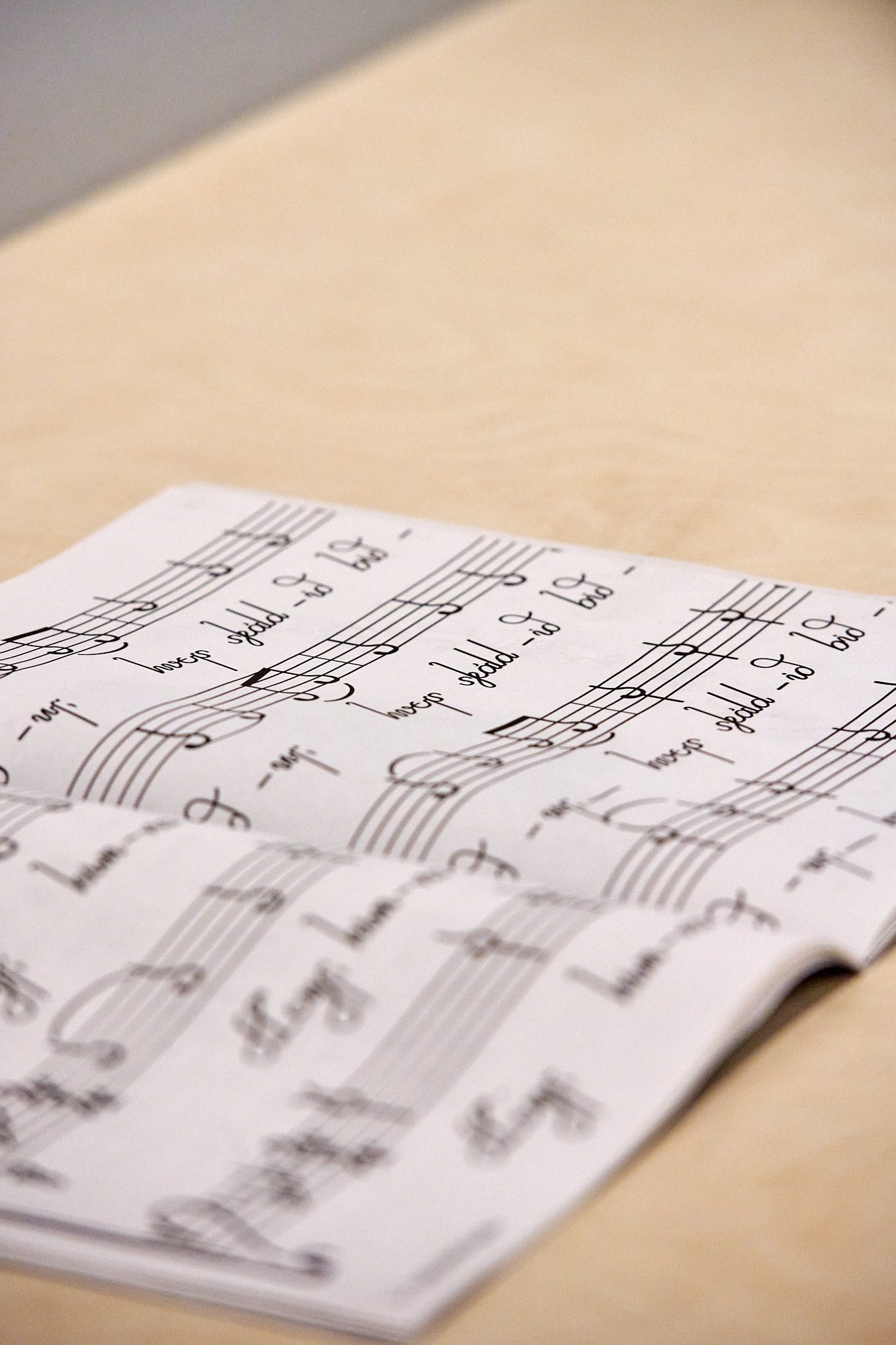
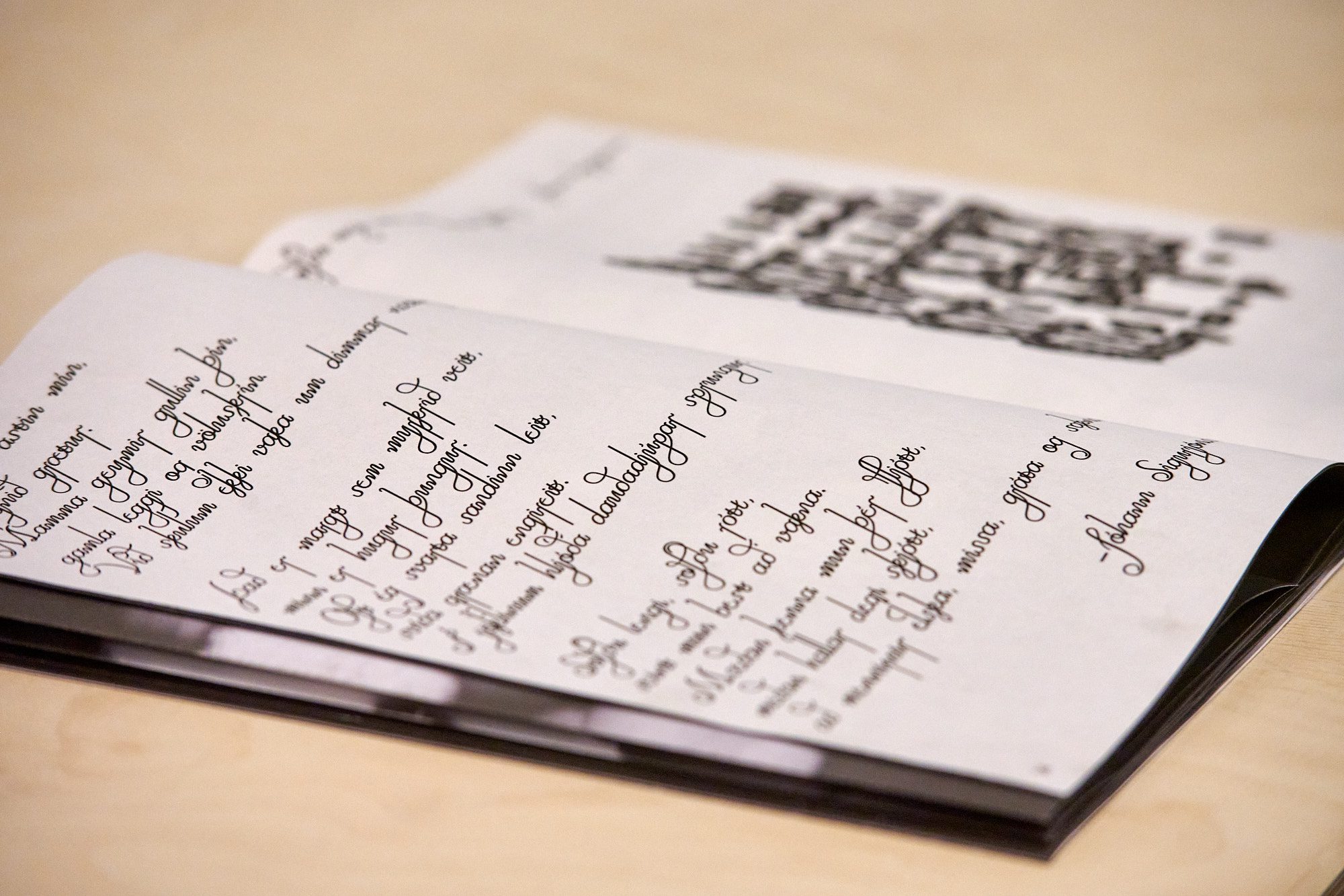
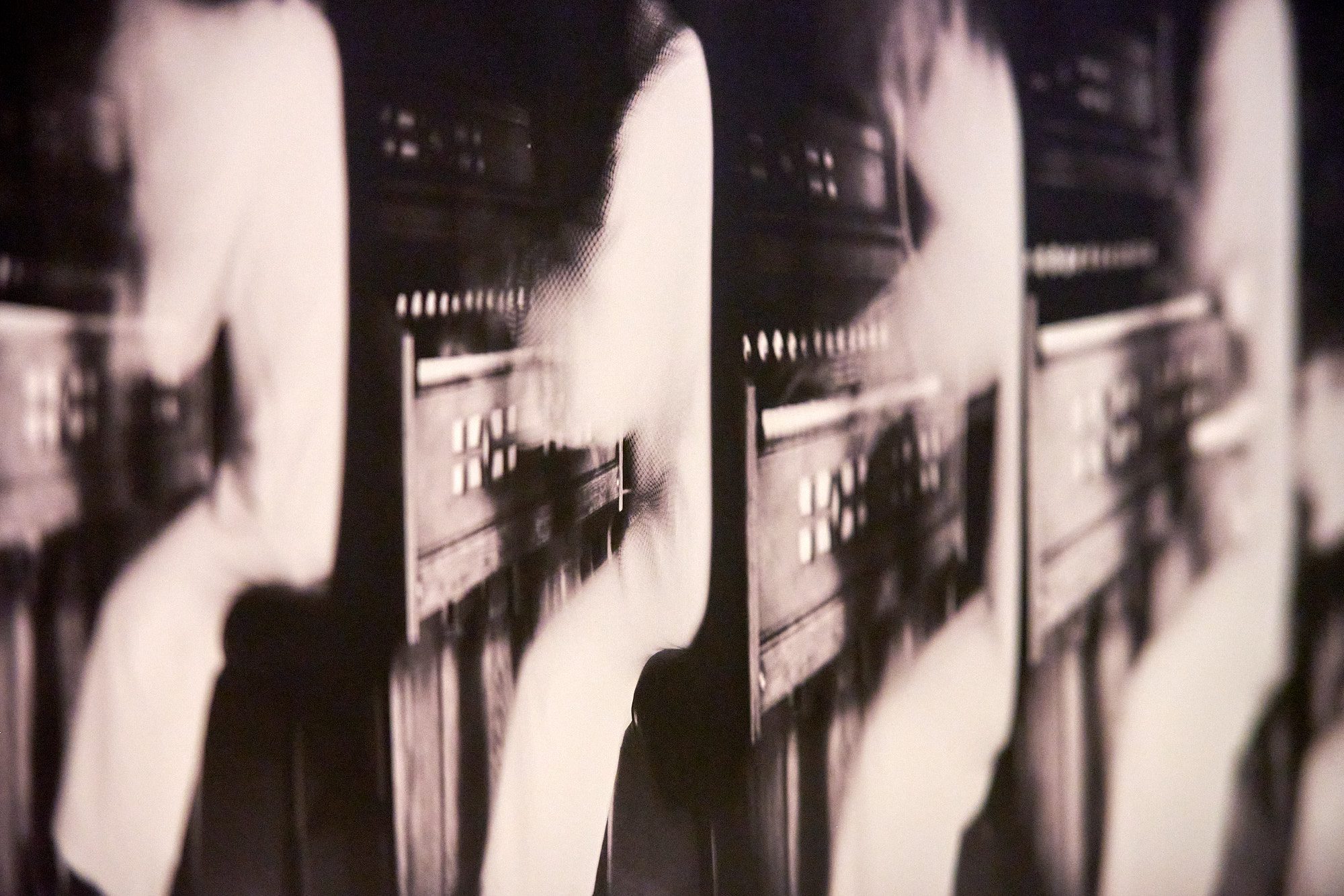
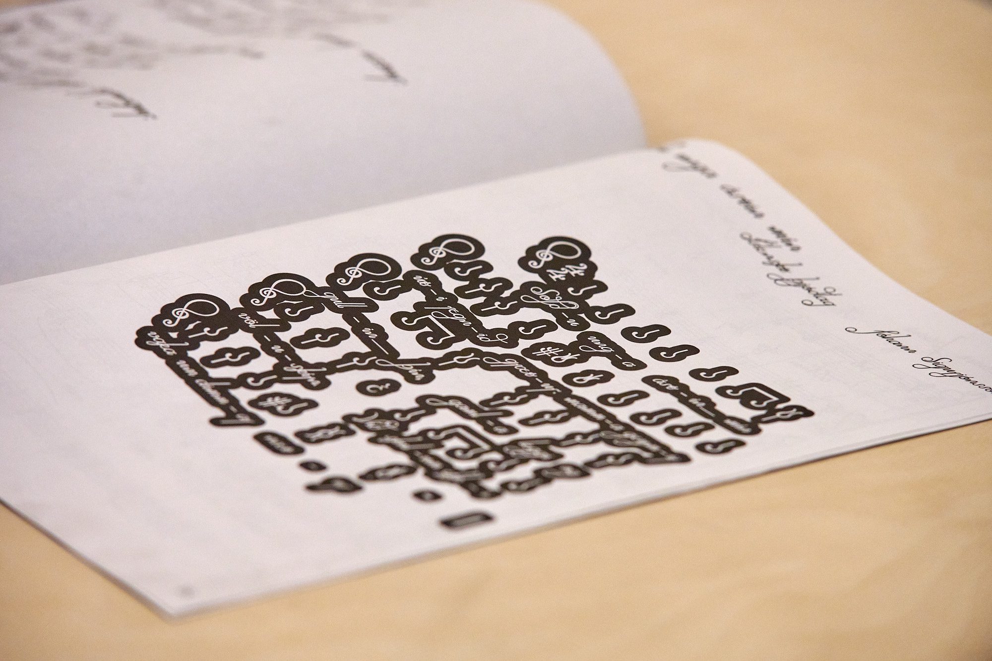
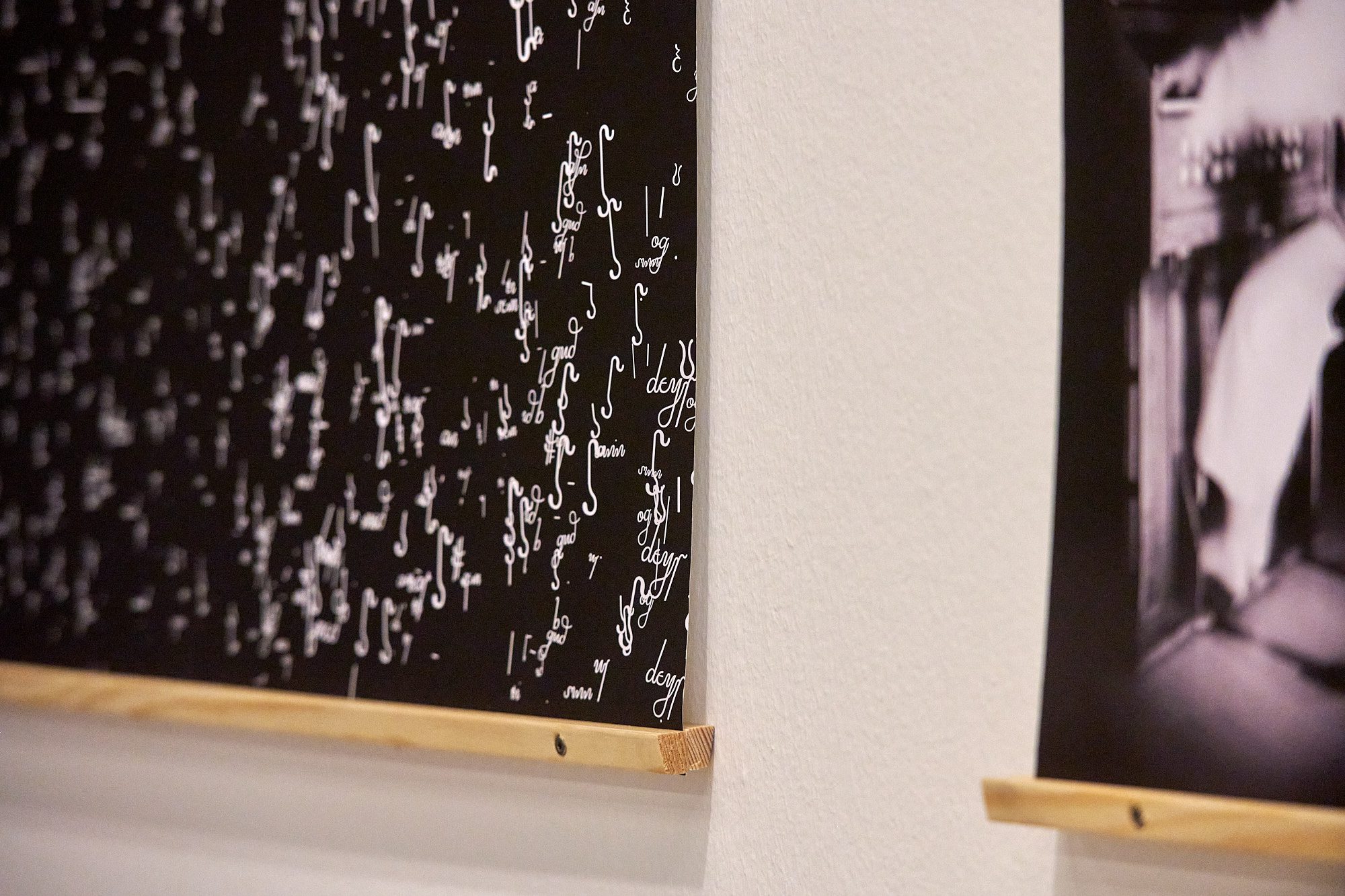
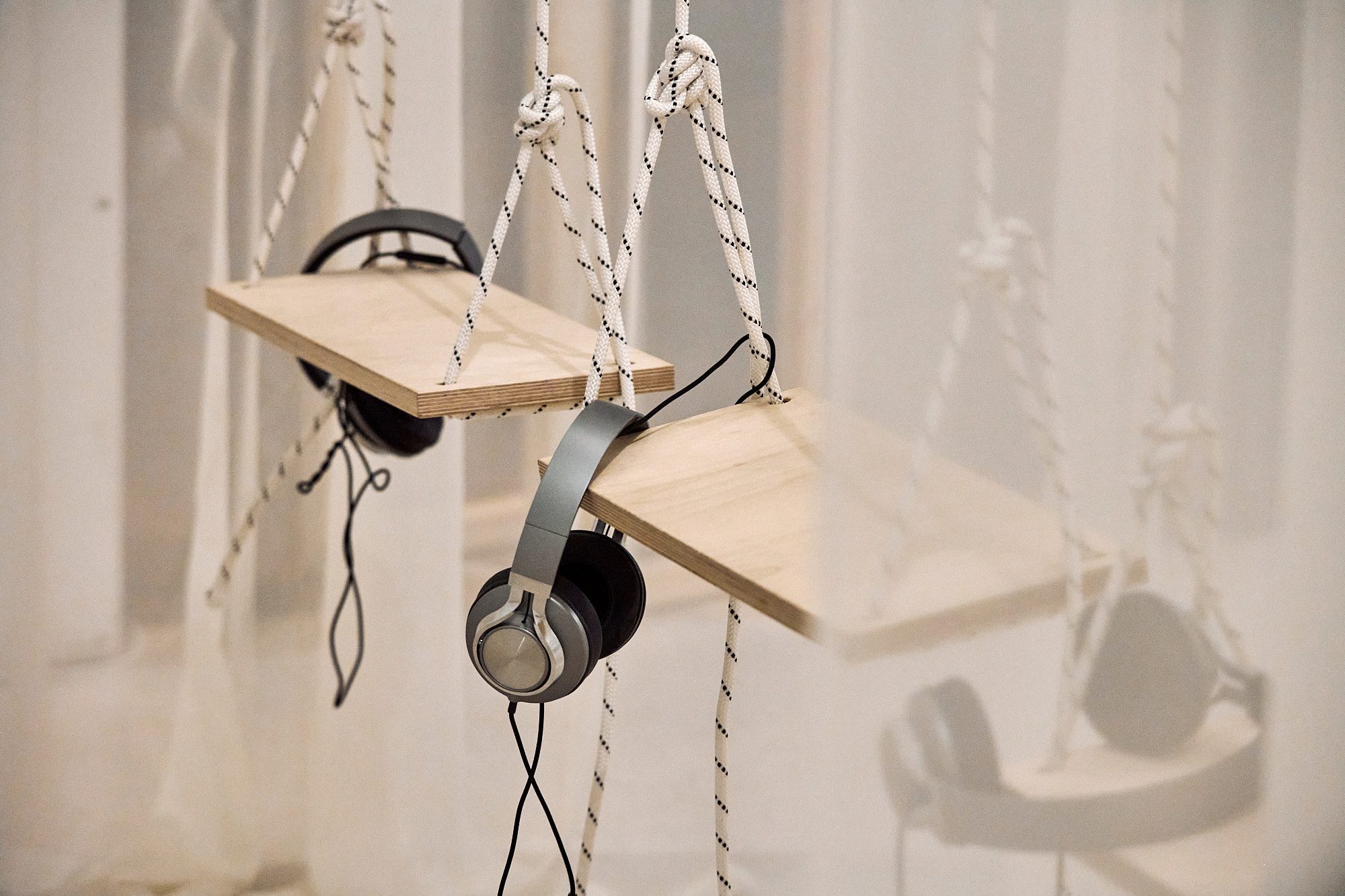
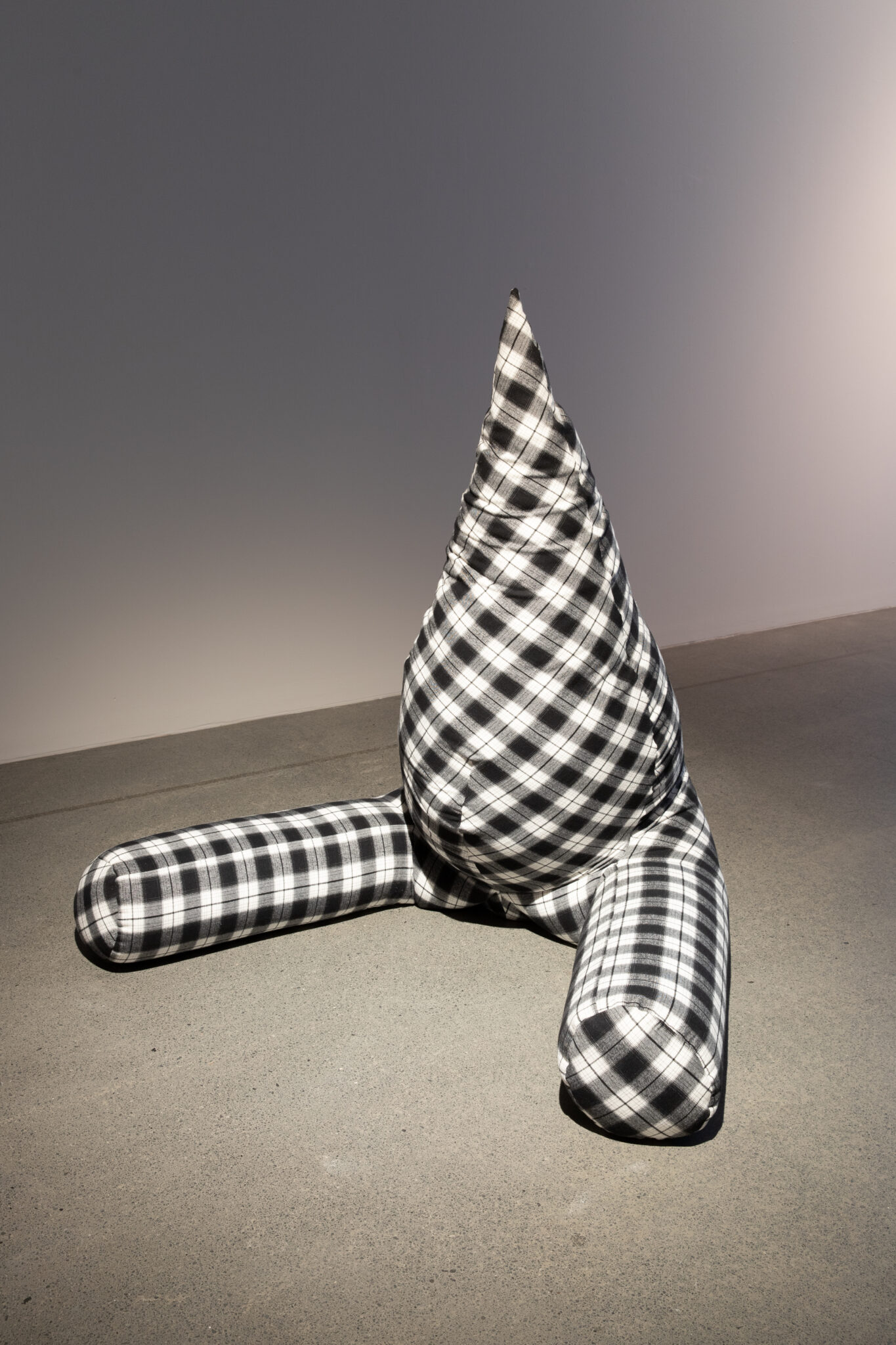
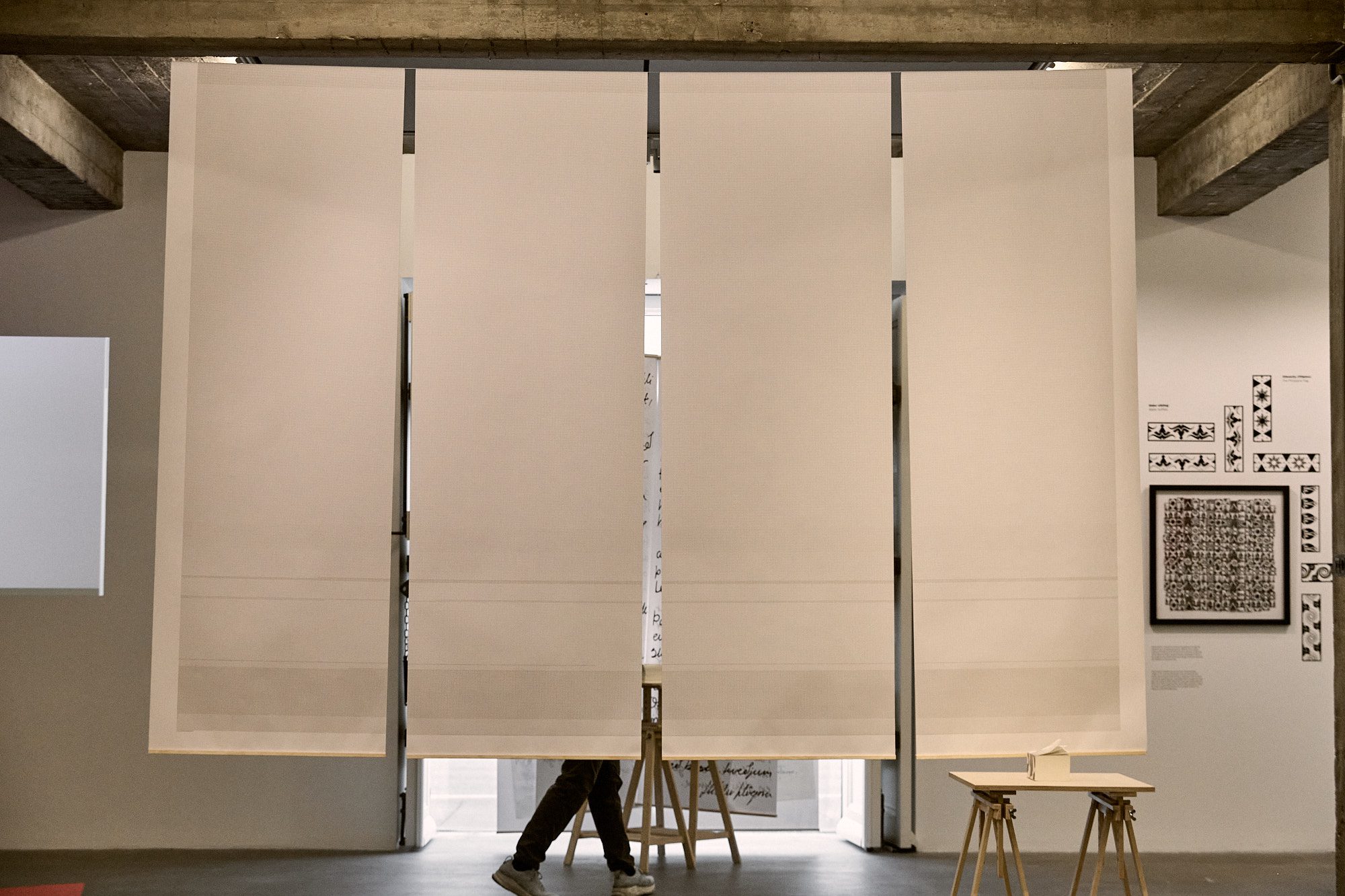
Verkið í myndum.