Automatic translation by Google Translate.We cannot guarantee that it is accurate.
Skoða vefinn á ÍslenskuHrafnhildur Anna Francis

Hamhleypa
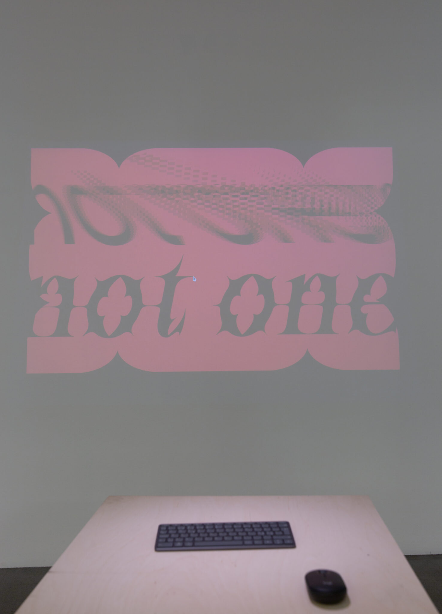
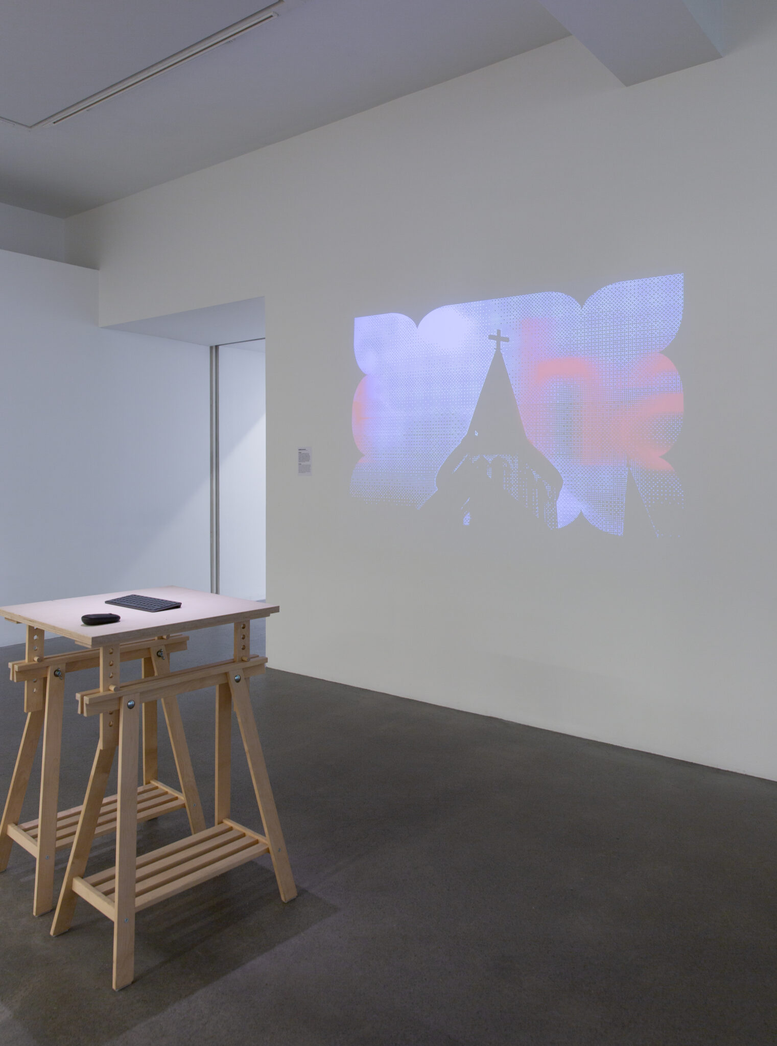
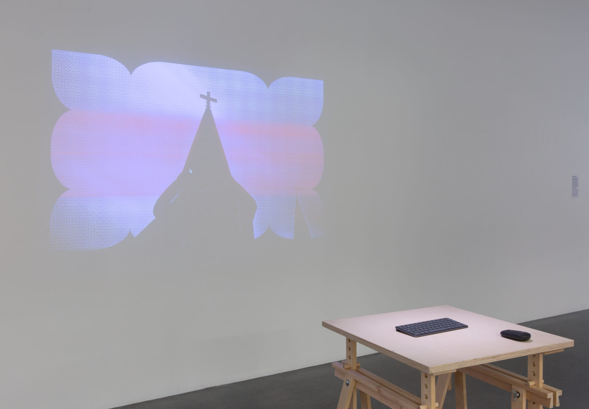
Hamhleypa er breytilegt letur sem tekur á sig tvær mismunandi myndir. Það hefur í raun tvo persónuleika. Sá fyrri er geómetrískt steinletur, sem er lítið í sér og heldur
kunnuglegt. Hinn sækir innblástur úr gotneskum stíl frá miðöldum Evrópu, nánar tiltekið í oddboga og mynstur sem finnast í gluggaflúrum (tracery) gotneskra kirkna. Letrið er „uniwidth“, sem þýðir að stafir letursins taka ávallt jafn mikið lárétt pláss í hvorum ham, og á öllum skrefum þar á milli. Það gerir letrið sérstaklega nothæft í stafrænu umhverfi.
//
Hamhleypa is a variable typeface that takes on two different forms. It actually has two different personalities. The first is a geometric sans-serif which is modest and rather familiar. The other draws inspiration from the Gothic architecture of medieval Europe, specifically the pointed arches and patterns found in the tracery of Gothic churches. The font is “uniwidth”, which means that the letters of the font take up the same amount of space on either side of the axis. This makes the font ideal for the digital environment.
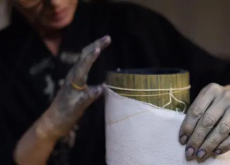
Photos by: Sisters Lumiere