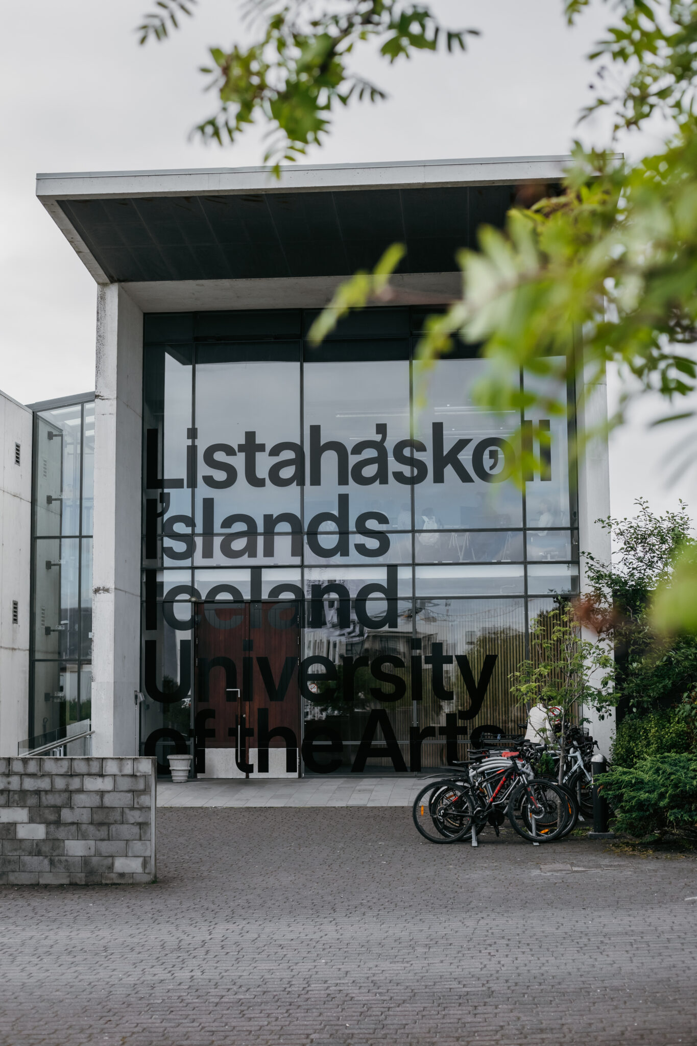
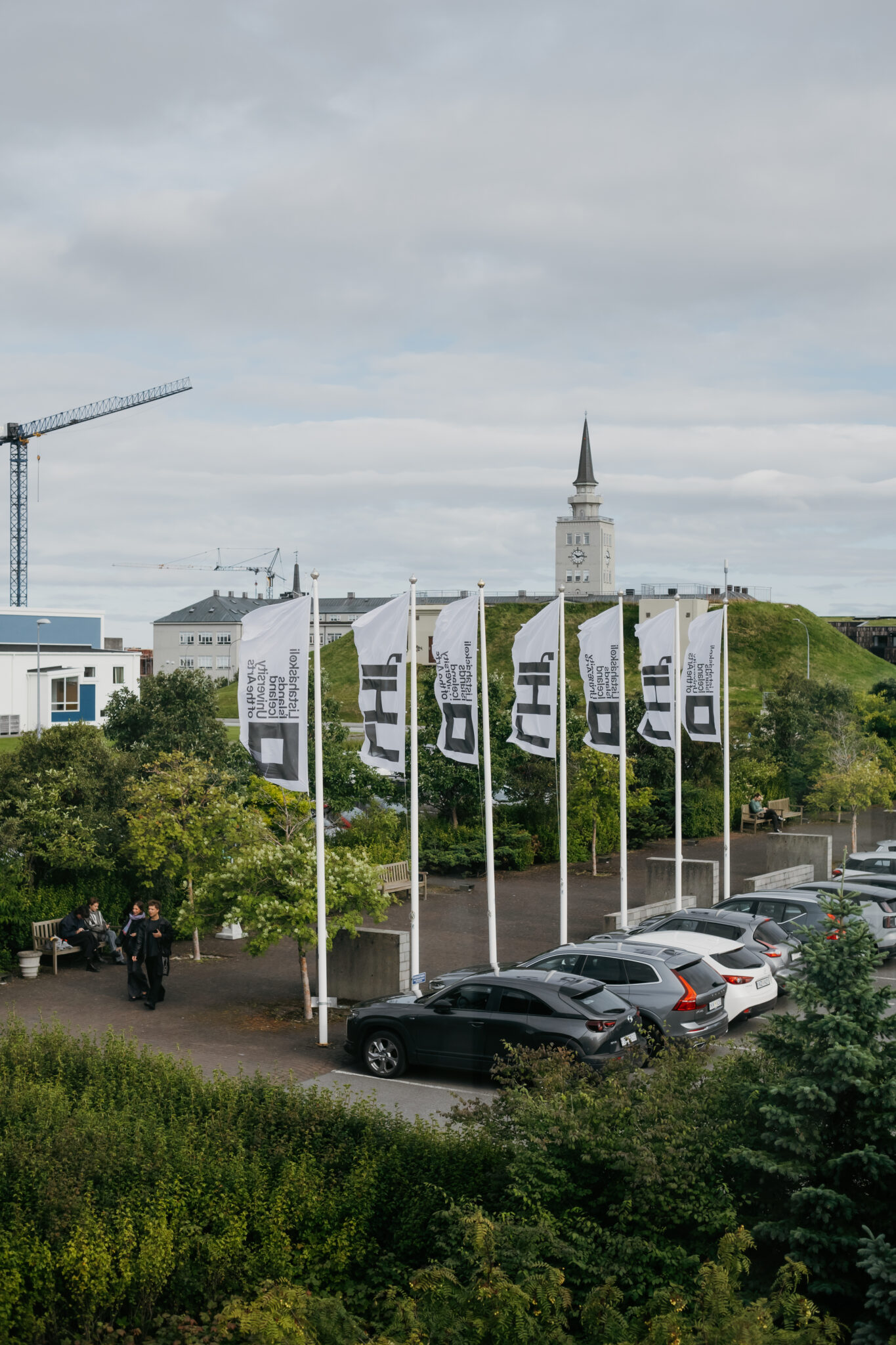
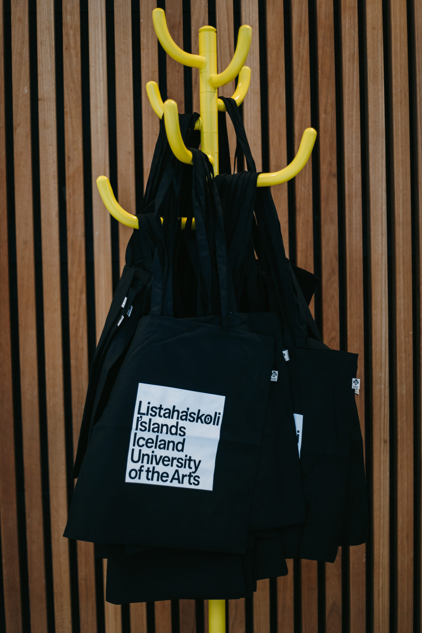
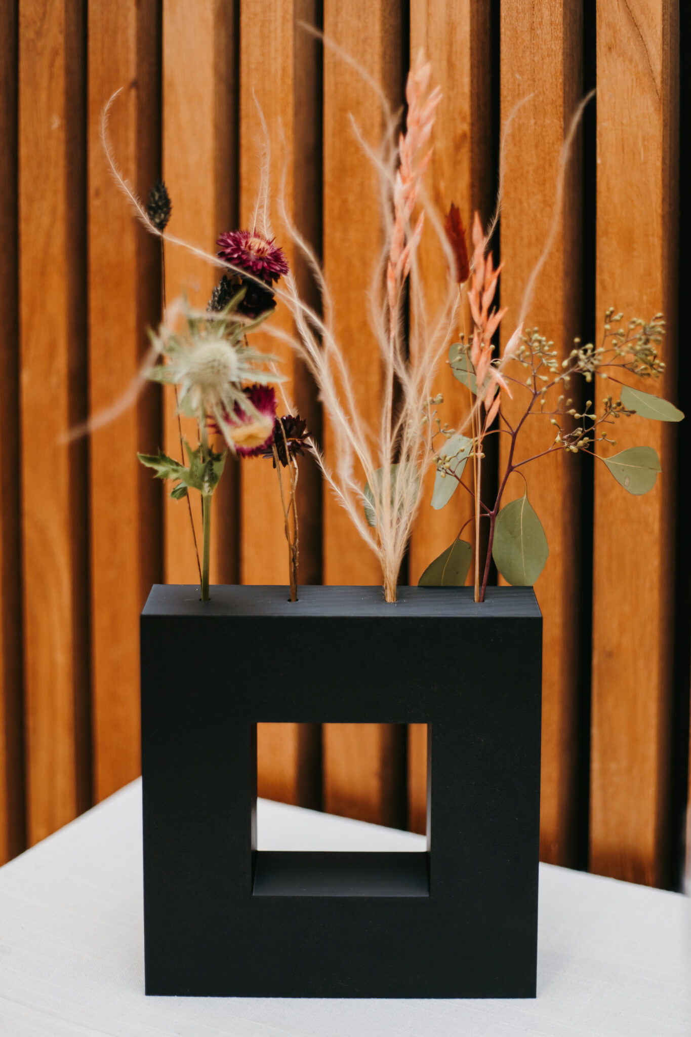
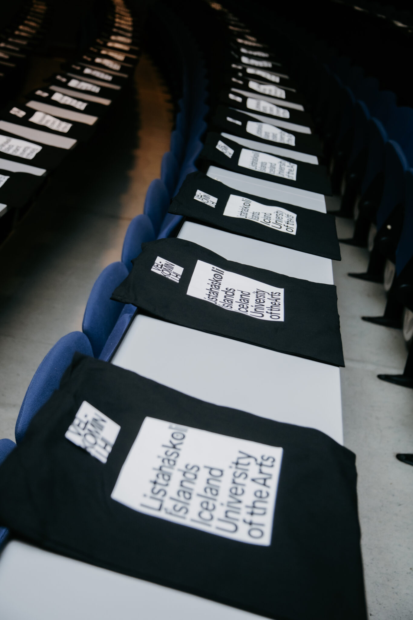
Í august 2026 introduced Academy of Arts Iceland new face which worked was in partnership we Karlssonwilker and builder has over two decades of development and history of the school.
The rebranding process began in the fall of 2024. The goal was to strengthen and clarify the school's image and to standardize its presentation across different media. and about way reflect the diversity of studies, teaching, research and artistic creation at the school.
In addition to Karlssonwilker, graphic designer Dagur Eggertsson and Gunnar Vilhjálmsson from Universal Thirst joined the project. Gunnar Vilhjálmsson developed a special font for the school, which is one of the key elements of the identity. The font supports a consistent and recognizable presentation of IUA across all media.
Karlssonwilker Design Studio

The design studio Karlssonwilker was founded in 2000 by Hjalti Karlsson and Jan Wilker, who met while working together at the design studio of Stefan Sagmeister. Vera Yuan joined the studio as a partner in 2020. The firm is based in New York and is known for projects in brand development, experiential design, signage and wayfinding, and digital design. Its clients include the Reykjavik Art Museum, Bloomberg, Nintendo, The New York Times, the United Nations, Samsung, and Vitra. Karlssonwilker has received international recognition for its conceptual and research-driven approach to design.
The square in the school's history
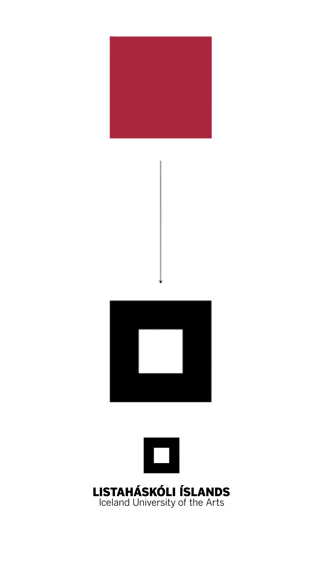
During the development of the face, the visual history of Iceland University of the Arts was considered. The school's first logo was designed by Guðmund Oddi Magnússon, a former professor at the school. Red, a filled square was in the foreground and became a characteristic symbol of the school.
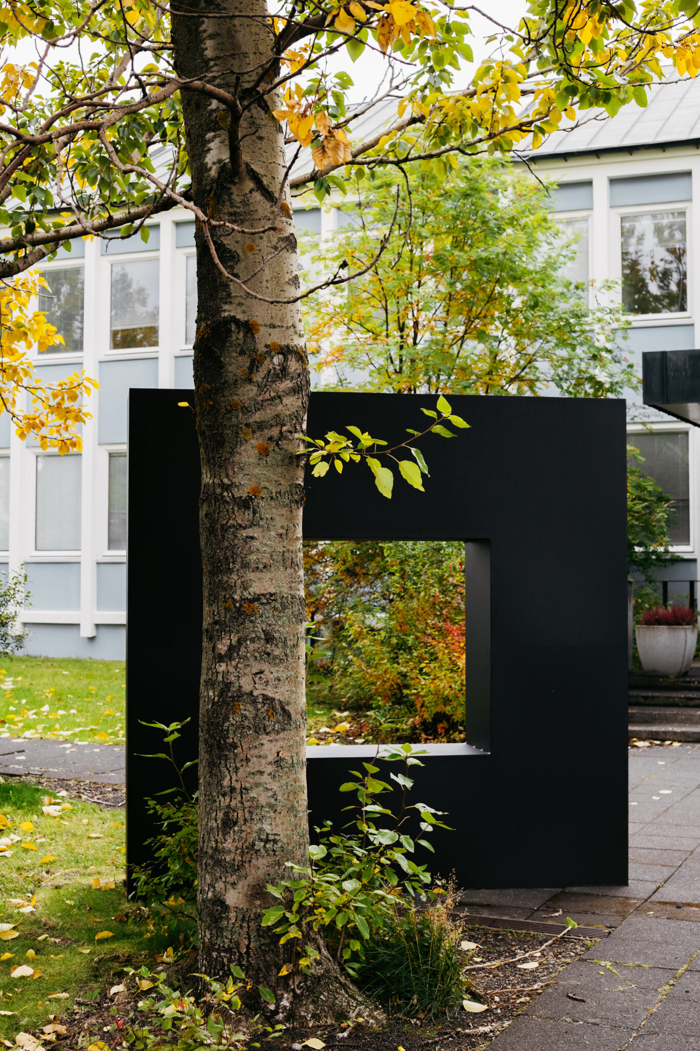
In 2012, designer Ármann Agnarsson was tasked with further developing the appearance. The form and meaning of the original symbol were retained, but the red square became a black frame with an open center. The square thus took on the role of a window, pointing to new possibilities, knowledge, and perspectives.
The story of the mark is impenetrable part off story IUA. The trigger that the sign is on cover sheet music the composer's Jóns Leifs which given was out in Leipzig.
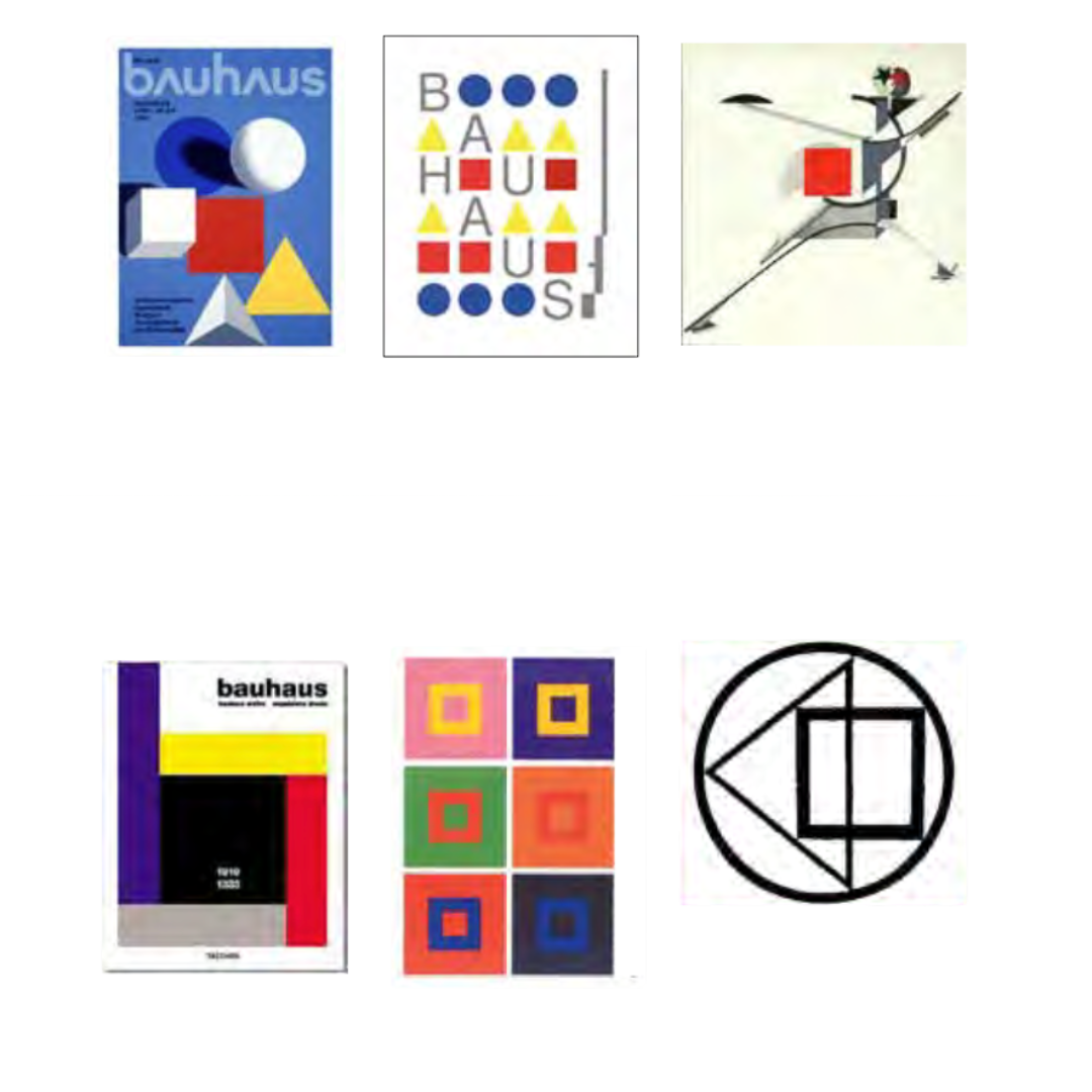
The square is ancient reference í starting field refers also to main originators modernism theirs Kazimir Malevich, El Lissitzky and Josef Albers, which often is taught we Bauhaus and is one best known for image world sinn „Homage to the square“.
The square gets an afterlife in the new logo of IUA
This one development from red square over í black window became important episode í face the school á next years. Newtt appearance builds onward á that one thought that visual representation the school see not only id holds also symbol about role hans which platform for artistic practice, research, education and new ideas.
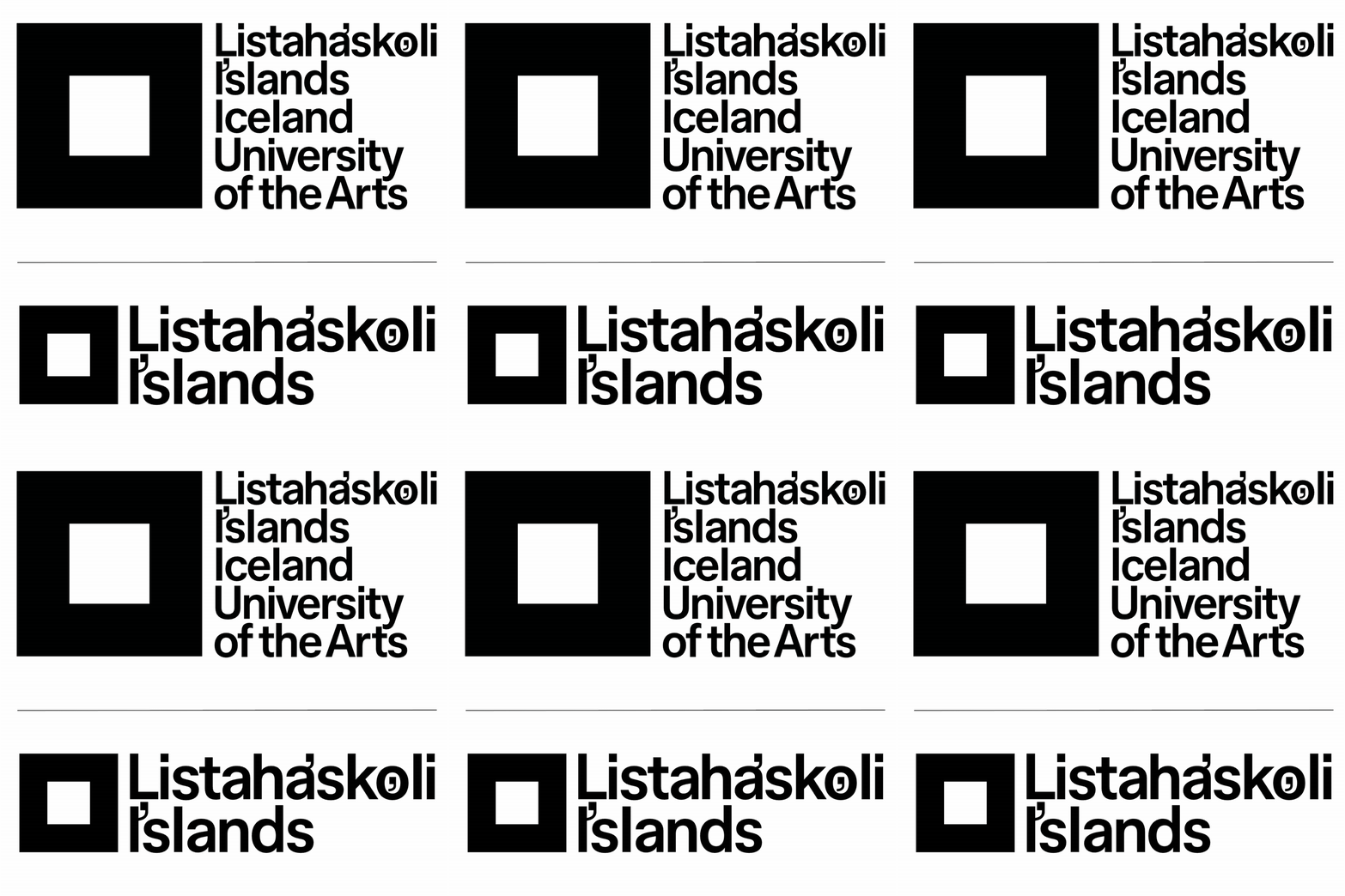
Black the square holds sees í new appearance the school but gone are new leads í game with the square. So which with because that let he frame in activities the school, but photographs off projects students and from activities the school through also key role í newer face.
The square able í newer face also that spin and comes much we story í new the font.
A common framework for the entire school community
The new identity can now be seen throughout the buildings of the Iceland University of the Arts, where it frames the school's diverse work and brings its different parts closer together. The rebranding is therefore not just about appearance, but about creating a clearer shared framework for students and staff, across departments and locations. We extend our best thanks to Karlssonwilker for their collaboration and look forward to seeing the new identity continue to come to life within the school community.